


Why does it seem that at any moment our library could blast off to colonize distant worlds? At some point or other this burning question has crossed the mind of every Northwestern student, at least when he or she isn’t secretly disappointed that the Olsen twins won’t be moving in next door.
We need to figure out what that architect was thinking when he designed what looks like a series of upside-down Mayan temples on crutches.
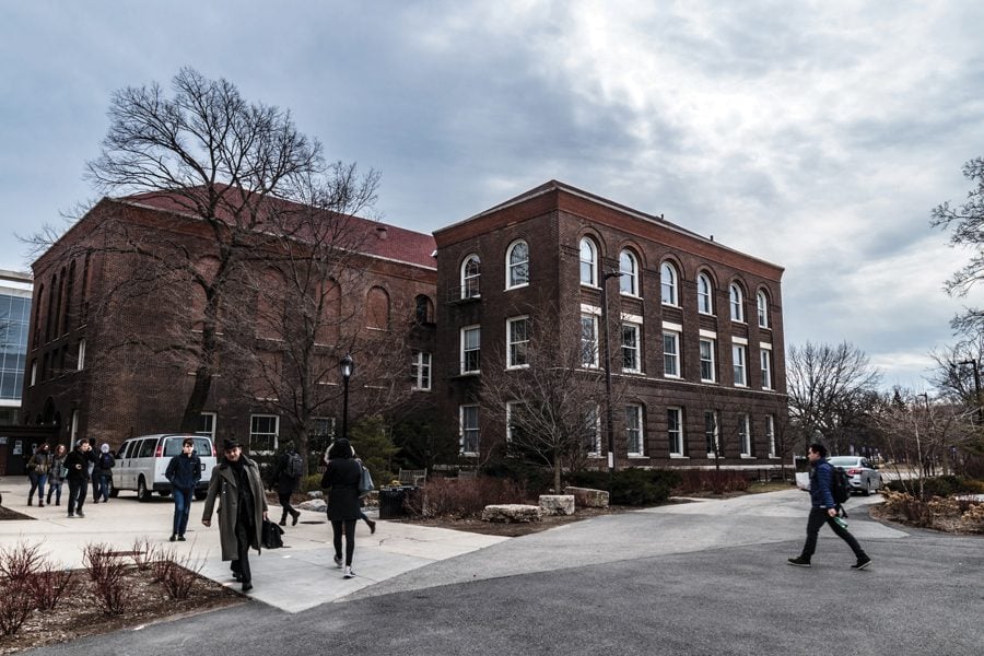
Built from 1964-1970, the library was designed by Walter Netsch. Netsch’s other works include the Art Institute’s East Wing, a multi-faith chapel at an Air Force base in Colorado and our own Rebecca Crown Center. Which makes you wonder, why did NU’s campus-planners let Netsch get his paws on the library when they had already seen what he had done elsewhere on campus?
Netsch intended the Rebecca Crown Center, which faces Evanston, to serve as a sort of entrance to the campus, a gateway between Evanston and the university.
Were I an Evanston resident, I would never enter the campus via Rebecca Crown. The glass slits — with the limestone uvulas that dangle in front of them — look as if they hold community prisoners, fugitives of the NU empire.
The library, similar to the Crown Center in layout, is an extension of the same architectural idea: a steel-reinforced exploding onion. Like the Lakefill, the library was supposed to, re-orient the campus toward the lake instead of Sheridan Road.
Netsch knew it was experimental. He is the founder — and perhaps only follower — of Field Theory, an architectural aesthetic that aimed to “tweak” the static grids of conventional architecture to create an environment that would accordingly “tweak” the behavior of its occupants. He wanted to do away with the everything-squared-away order that dominated prior library design and create a learning center more geared toward browsing. Hence the themed stacks and convoluted layout. I think he succeeded; I haven’t been able to find a damn thing in it.
Which is why our library fails. A building, like a work of art, may have an aesthetic goal; unlike a work of art, a building has a certain obligation to be functional. Finding something in a library should be as straightforward as possible, not some bizarre intellectual version of “Pin the Tail on the Donkey.” Libraries are generally rectangular for a reason: Books fit well into spaces with right angles. The circular stacks, let’s be honest, are a bitch to navigate. If stacks were meant to be circular, books would be circles.
The University of Chicago, not a school notorious for its browsing scholars, unsurprisingly rejected a similar design of Netsch’s in favor of a library geared toward actual research.
So why did NU accept his design?
Because this isn’t the University of Chicago, whose campus was originally modeled after Oxford. Here at NU, we don’t import our architecture, or really much at all, from high-brow academic culture. Perhaps we represented, at the time Netsch proposed the library plan, a new strain of higher learning, a hybrid university that would remain serious without necessarily emphasizing scholarship. That would nanofabricate by day and dream of the Olsen twins by night. But we should keep in mind that the library failed, and that the Olsen twins will never come here.
Tim Requarth is a Weinberg senior. He can be reached at [email protected].