Lee: Why Comic Sans is useless
January 5, 2017
I’m the former creative director at The Daily, and I’m writing a new series of columns about how typography subtly and thoroughly pervades our lives. I hope this series will reveal the powerful ways fonts can redefine arguments and dramatically change a text’s meaning.
On my way home from D&D’s with a box of LaCroix in one hand and a bag of veggies in the other, I passed Dave’s New Kitchen on Noyes. More specifically, I realized I was passing its menu, humbly printed on a sheet of U.S. Letter and scotch taped onto the window. Something about the menu caught my eye half a block away.
The menu was written entirely in Comic Sans! I gasped. I wasn’t very font of it.
But let’s go back to the beginning. In 1994, Vincent Connare was faced with a dilemma. His coworkers at Microsoft had created a new user-friendly interface for its operating systems that organized its software components into a cartoon image. On the illustrated home screen, which was designed to look like a living room, Rover the talking dog would speak — quite seriously — in Times New Roman to help guide users through the program. Connare designed Comic Sans to give the dog a voice that fit his personality and purpose. Since then, the font has spread to other Microsoft applications and into common use.
Unfortunately, two decades later, everyone hates Comic Sans. Why? Despite the soft, round nibs that trim the childish, somewhat mocking letterforms, Comic Sans is by no means a poorly designed font. Vincent Connare is a professional type designer, and his creation served its purpose well in 1994. It’s likely that only a few of the people that criticize Comic Sans (so, basically the entire human population) could have designed a better font given the constraints.
Despite its rich and storied past, I too find Comic Sans generally disgusting. Connare might have created Comic Sans to solve a problem, but unfortunately it isn’t good for much else. Especially in print, Comic Sans looks mostly like it’s been drawn by a 5-year-old Sharpie.
Furthermore, from a practical standpoint, I avoid Comic Sans because of its recognizability. The only thing you know for sure about Comic Sans is that it’s probably the one font everyone can name on sight. Unfortunately, with that comes a generally negative image of unprofessionalism reminiscent of your elementary school days plonking away on typing games.
The power to evoke emotions is not unique to Comic Sans. Imagine a stop sign written not in the classic, screaming HIGHWAY GOTHIC developed by the U.S. Federal Highway Administration, but in a loopy script like Zapfino. Or, better yet, a stop sign in Comic Sans.

One of these fonts shouts louder than the others. Fonts, contrary to common belief, communicate both visually and audibly.
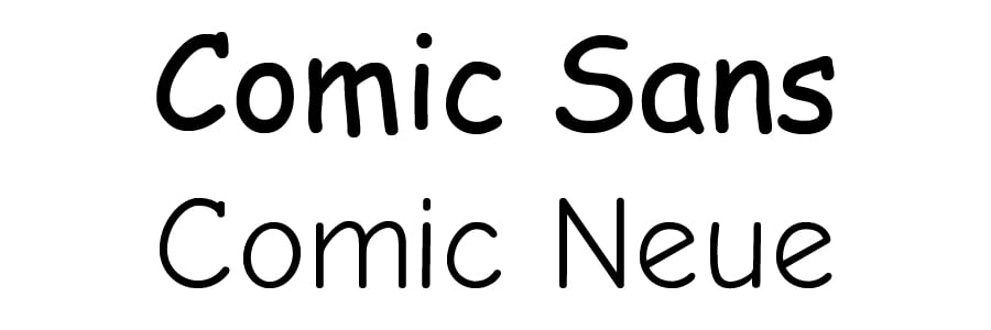
Today, there is little use for Comic Sans. The font carries a negative association that cheapens everything it graces. A better alternative exists in Comic Neue, which captures the whimsical personality of its predecessor without that permanent-marker look. A new open-source font released in 2014, Comic Neue is free and available in a variety of weights and angles.
Like most things in life, we should try to understand why we dislike a font before we jump on the bandwagon. Because of its common associations, Comic Sans is generally unusable and while their carbonara is top-notch, Dave’s should consider a different font for their menu, especially when it’s posted outside.
Like Papyrus.
Jerry Lee is a Medill junior. He can be reached at [email protected]. If you would like to respond publicly to this column, send a Letter to the Editor to [email protected].
The views expressed in this piece do not necessarily reflect the views of all staff members of The Daily Northwestern.