Lee: Watch the spacing between your letters
January 16, 2017
I’m the former creative director at The Daily, and I’m writing a new series of columns about how typography subtly and thoroughly pervades our lives. I hope this series will reveal the powerful ways fonts can redefine arguments and dramatically change a text’s meaning.
You’ll notice that the body text for every story in a copy of The Daily fills exactly the amount of space that it needs to: Every reporter’s email is always on the last possible line it could be printed. This magic is only possible because designers at The Daily adjust the “tracking” of the body text. Tracking is defined as the amount of space between each letter for an entire segment of text — so a line can be tracked l o n g or short to fill exactly the allotted space on the page. This seems like an incredible tool in theory, but tracking has to be done carefully so that you don’t make the word t o o h a r d to read. If you track a word out too long, it reads very slowly, while if you track a word out too short, it resembles a television screen full of static.
The text on the SOURCE logo located outside The Daily’s office on the third floor of Norris tracks out widely, and this makes symbolic sense. It communicates a sense of inclusiveness that aligns with SOURCE’s mission: to be a multipurpose space where students can find resources to complete all kinds of projects. The background hexagon, divided into sections, appears to symbolize the many facets of student life, which is then reinforced by the various shades of purple — your True Northwestern™ can come in any shade of purple, and SOURCE manages to stretch awkwardly across all of these variations.
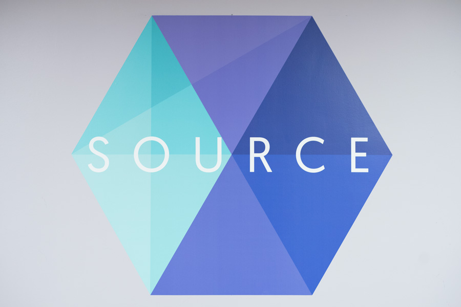
Despite the inspired visual metaphor, the SOURCE logo makes my eye twitch for a different reason — the tracking. Zoomed in, you’ll notice that the U and the R appear to be spaced out unequally from the center. I’m sure that the tracking is accurate, and every letter in SOURCE is spaced out equally, but the combination of the equilateral hexagon symbol in the background combined with the highly symmetrical typeface only reinforces the absolute necessity for imperfections like this to be highlighted.

This undoubtedly makes the logo a tragedy — but not directly because of the flaw itself. Minor imperfections like this make it sorely clear that the logo was designed by a human being. The logo was manufactured, and draws attention to itself instead of the subject matter it represents. The best logos are the ones that you don’t realize are actually logos. Before getting into the symbolism and representation behind an icon, a good logo can’t distract from the subject it represents. For example, the Nike swoosh just is Nike — before anything else, its identity is entirely wrapped around the corporate entity.
This explains in part the larger global trend of moving toward wordless logos. MasterCard moved its text off of the recognizable double circles and put it off to the bottom, likely because it wants its logo to be more iconic. That is, MasterCard wants it so that you can’t see two circles in those colors and that orientation without immediately associating it to MasterCard, the entity.
This effect is harder to achieve with text, because it’s incredibly hard to manipulate lettering so that you don’t realize someone physically typed it out. You never want to have to read an icon, only see it. Moreover, any available typeface that used for a logo is bound to have appeared somewhere else. Even “The Daily Northwestern” is printed in Goudy Handtooled, which is a typeface that can be found again several blocks south of campus on the awnings of “Cottage Jewelry” on the intersection of Chicago and Dempster.
This isn’t my only problem with SOURCE’s logo — the white text on a lightly colored hexagon is unnecessarily difficult to read, which further exacerbates how painfully obvious it is that the logo was poorly manufactured. That said, as members of the University community, we should all give some consideration to the messages behind the imagery of campus institutions.
Through the SOURCE logo, the Office of Campus Life effectively communicates its inclusivity, set a little off-center.
Jerry Lee is a Medill junior. He can be reached at [email protected]. If you would like to respond publicly to this column, send a Letter to the Editor to [email protected]. The views expressed in this piece do not necessarily reflect the views of all staff members of The Daily Northwestern.