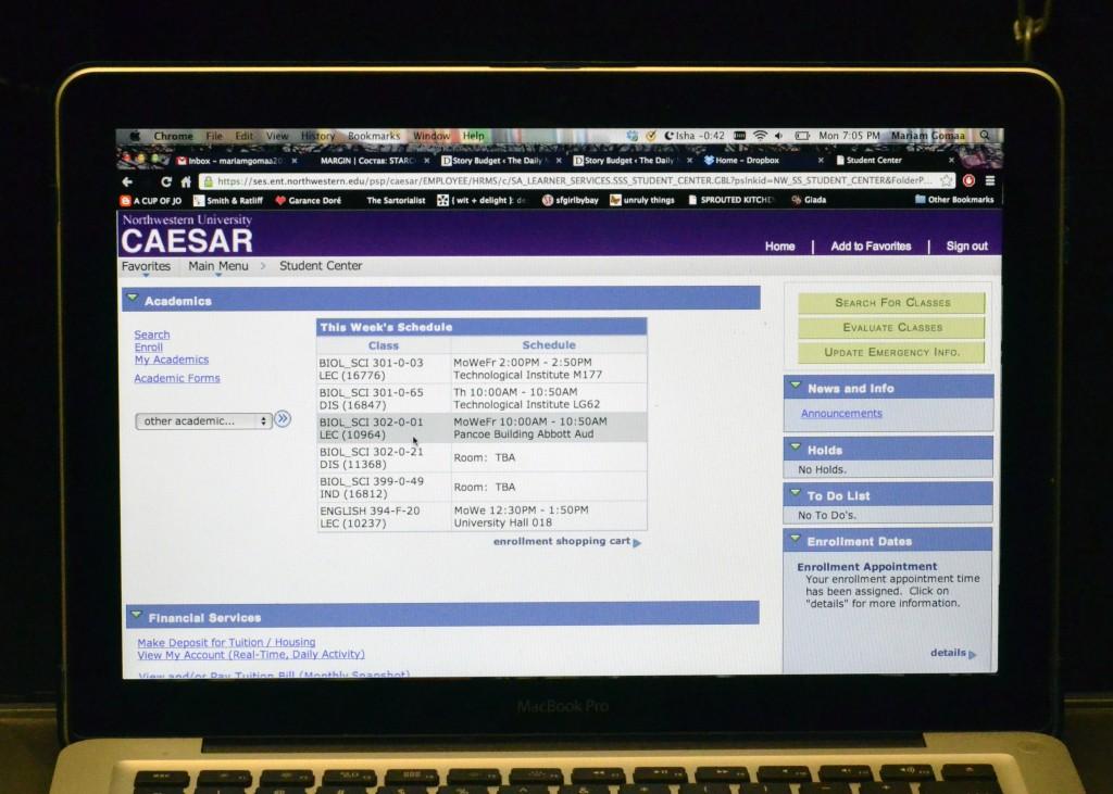
After numerous complaints from students about navigation and usability, Northwestern University Information Technology is revamping the home page of CAESAR, NU’s online registration system.
By the end of October, the site’s “Student Center” page will be updated to improve accessibility and reduce confusion, said Ann Dronen, director of student enterprise systems for NU.
NUIT currently plans to release the upgraded page for student use after the weekend of Oct. 20.
While still under development, the new landing page’s navigation is meant to be more user-friendly for students, Dronen said.
“We’re trying to have a more logical way and an easier way for students to get what they need to get to,” she said.
As the go-to source for class registration, financial aid packages and academic transcripts, NU students use CAESAR on a regular basis. However, the majority of students are unhappy with a number of the site’s features, including navigation. Students often do not know where exactly to find specific items, such as contact or payment information, Dronen said.
NUIT is attempting to tackle these problems by grouping related items under the same category. For example, the new site will have all financial-related elements grouped together, Dronen said.
The changes to CAESAR come a month after the overhaul of the home page of the University’s main website. Communication senior Savan Patel said he has observed little change to the configuration of CAESAR during his time at NU.
“They seem to change a lot of things, but CAESAR, which is pretty important, has been pretty static over the last four years,” Patel said.
NUIT began designing mockups for a new landing page after receiving feedback from a survey sent to the student body in mid-June.
“We’re doing an upgrade to the overall system, so it was a good opportunity to change the landing page for the students,” Dronen said.
About 2100 students completed the survey, which asked about which sections of CAESAR students use most often as well as what external links they would want linked to the site. NUIT also established two focus groups in late July and early August to gauge reactions to drafts of the new home page.
Dronen said NUIT plans to initiate further feedback from students after the new page is unveiled.
“We just want to make sure that we’re focusing on the most important things that are problematic for the students,” she said.
Although this month’s changes will focus primarily on the home page, Dronen said NUIT will continue working on the other problems with the site.
Among the common complaints about CAESAR is the inability to go “back” to previous pages on the site, something that proves especially problematic when students are selecting their classes. Currently, hitting the “back” button while searching for classes redirects users back to the Student Center landing page.
“Not being able to just click back has always been the biggest problem,” said Communication junior Chynna Ladage. “I would probably just be happy if they let us go back.”
That issue is more difficult to resolve, as the “back” function is related to the vendor that operates the page, Dronen said. However, the University is looking into the glitch as a potential thing to fix in the future, she said.
Additionally, the University will be looking into ways of improving the process of searching for classes, one of CAESAR’s main functions.
CAESAR will be inaccessible to students for several days during the upgrade, which will likely occur Oct. 19-21.
