From The Newsroom: How The Daily designs a print paper
Seeger Gray/The Daily Northwestern
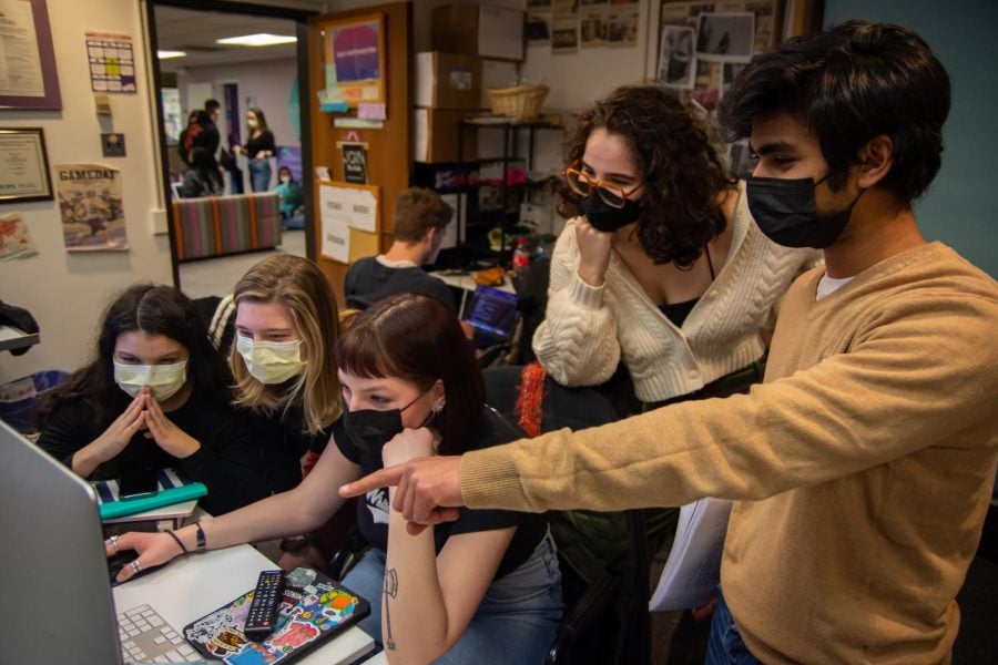
Daily staffers and editors work in the design room. Here’s how we lay out our print paper, and how you can join us.
March 4, 2022
In this series, Daily staff members hope to provide more transparency about how we operate. If you would like to submit a question to be answered here, please send an email to Editor in Chief Isabelle Sarraf at [email protected].
Contrary to popular belief, you don’t need to be a writer to get involved at The Daily. Producing a print paper is a team effort. Reporters create stories, illustrators and photographers provide visuals, and designers pull all of that work together and arrange a paper you can hold in your hands.
Here’s why our twice weekly print paper looks the way that it does, explained by a dive into all of the work our designers put in behind the scenes.
The structure of a print paper
Most print papers are eight pages long. The front page typically consists of four pieces highlighting breaking news and top stories, with two coming from the campus desk and two from the city desk. With each issue, we alternate the placement of campus and city stories, including which desk receives the larger front-page photo. The sixth page of the paper contains the rest of the text from each of these stories and is commonly referred to as a break.
The front page highlights the most important news of the day, so a lot of thought goes into its layout, both from a journalistic perspective and from a design perspective. The most important story usually receives the larger front-page photo, above the fold of the newspaper. (Here’s a look into how we choose what news to prioritize covering.) Our editor-in-chief, managing editors and news editors also have to consider which stories go well together in terms of tone when they compile the page.
Not every story can make the front page. Plus, word counts affect the placement of stories, because they determine the size of the accompanying photo and which other stories can be placed on the same page. That’s where our design team steps in. The editorial team offers advice to make sure stories not only fit on their pages, but also look good and receive the attention they deserve.
The second and third pages, called “Around Town” and “On Campus,” are half-pages dedicated to content from our city and campus desks, respectively. These typically contain one feature-length story and sometimes one short story from each desk.
The fourth and fifth pages vary depending on the night. We typically alternate between including an opinion section and an arts and entertainment section.
The seventh page is a “free-for-all,” where desk editors can choose which other pieces they want to publish in print. It’s typically half a page, with the other half containing advertisements.
The back page is dedicated to the sports desk. The first photo on the back page alternates sides each issue.
A print paper from start to finish
Editors meet in the newsroom every evening from Sundays to Thursdays to discuss what we’ll publish for the following day. On Sunday nights and Thursday nights, we also prepare to lay out the print paper, discussing the order, word counts and visuals for each story.
Designers can only place stories in the newspaper document once they’ve been edited by three to four editors, including the editor in chief. If we encounter problems with space and visuals, our top editors will either swap one story with another, change the paper’s layout entirely, or cut parts of the story out of its print edition. At the end of the night, the top editors write headlines. We then export the paper, upload it to the printer’s server and call the printing company to make sure they got it.
The process doesn’t look the same every night. During fall quarters, for example, we include a Gameday edition in our print paper every Thursday. For games played on home turf, we design a four-page insert with a themed-cover. Inside, in addition to sports stories, we’ll include an anticipated layout of the field, new photos and Big Ten standings and forecasts for next week’s games.
Perhaps the most satisfying part of the job is picking up a print paper from one of the newsstands located on campus and around Evanston.
Getting involved in design
No skills? No problem. It’s super easy to get involved with design. At The Daily, we have two design desks: Design and Illustrations. As part of the Design desk, you help lay out the print paper, in addition to special issues. On the Illustrations desk, you help create graphics for both web and print stories. Neither of these desks require any knowledge of any software. We train reporters in these skills when they join our team.
We host a general training at the beginning of each quarter, but anyone involved with The Daily is welcome to come talk with us individually. The majority of print paper training usually takes place on the job during print shifts — designers can sign up for a time to come to the Design room and help lay out a few pages. During this shift, we will walk you through how to lay out the paper and how to use Adobe InDesign, our primary editing software.
If you have any questions about joining our Design team or want to sign up, please reach out to the emails listed below.
Email: [email protected]
Twitter: @amittal27
Email: [email protected]
Twitter: @yikesmeher
Related Stories:
— From the Newsroom: How to pitch The Daily a story idea, and how we decide what news to cover
— From The Newsroom: The Daily’s corrections and fact-checking process, explained
— From The Newsroom: How The Daily decides which op-eds to publish


