Journalist Allison McCann discusses role of data visualization, graphics in storytelling
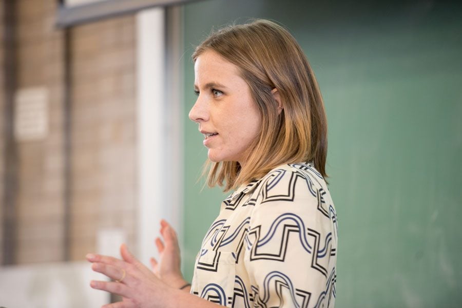
(Colin Boyle/Daily Senior Staffer) Allison McCann, a visual journalist for Vice News Tonight, discusses the role of data visualization and graphics in storytelling. The event, held Tuesday in Swift Hall, was part of One Book One Northwestern programming as well as the Cognitive Science Speaker Series.
January 18, 2017
Allison McCann, a visual journalist for Vice News Tonight, explained the role of data visualization in newswriting on Tuesday, saying that it should be used to augment the reader’s understanding of a story.
“Against Boring Charts” — an event hosted by faculty and staff from One Book One Northwestern, Knight Lab and the cognitive science and mathematical methods in the the social sciences departments was part of One Book One Northwestern programming as well as the Cognitive Science Speaker Series. About 60 people attended the event in Swift Hall.
McCann formerly worked for FiveThirtyEight, the website created by Nate Silver, author “The Signal and the Noise,” this year’s choice for One Book One Northwestern. McCann explained the power of compelling charts and graphics in helping create a more engaging story.
“If you can say it in a sentence, you usually don’t have to make a graphic,” she said.
Cognitive science Prof. Steven Franconeri, an organizer of the event, said the expression of data has evolved in recent years. Rather than simply collecting data, students and workers need to be able to convey their findings to an audience who may not necessarily be experts in the field, he said.
“Data’s a big thing this year,” he told The Daily. “(Data presentation) is an important life skill, and we’re teaching it here at Northwestern. If you’re going to have that holistic perspective, where you’re somebody who knows the numbers and knows the solutions, you also need to be able to communicate those solutions.”
In addition to showcasing some of her favorite graphics and explaining how to use visual aids effectively, McCann discussed her own creative approach as well as her previous roles in print and web journalism.
She said reporting is the first step in crafting a data story. Though gathering the necessary data for an assignment is “half the battle,” McCann said a good story should still convey a strong message, using data visualization as an aide to help the reader better understand any given material.
Reyhaneh Maktoufi, a graduate student in the School of Communication, said she was surprised at McCann’s advice to deviate slightly from the status quo. Because simplicity is often celebrated, it was interesting that McCann cited a little complexity and excess information as good things, she said.
Maktoufi said she is currently using data visualization as a volunteer doing research at Adler Planetarium’s Space Visualization Lab.
“It’s a good complementary thing to see the type of data visualization that I see in astronomy and physics,” she said. “It’s good to see examples of how it works in news and how it could possibly work in other fields.”
Email: [email protected]
Twitter: @jakeholland97