Northwestern officials are creating a new logo for the university in an attempt to step up marketing efforts and combat a decline in admissions applications this year.
The logo will replace NU’s seal – a purple-and-white circle containing the university’s motto – on most NU documents.
After conducting a branding and institutional identity study Spring Quarter 2000, NU officials hope the new logo will appeal to prospective students and reduce the university’s “cluttered visual identity,” said Alan Cubbage, vice president for university relations.
Although NU will continue to use its athletic “N” logo, administrators plan to use the seal much less frequently. The seal was originally designed to be an official mark on diplomas and transcripts, but it has become “bastardized” and overused, said Cubbage, who oversaw the branding study.
He said current students feel little connection to the seal’s Latin lettering – if they know what the seal looks like at all.
“The problem with the seal is that it doesn’t work real well in small sizes, and it’s somewhat old-fashioned,” Cubbage said. “It’s this wonderful old Methodist heritage that really doesn’t have anything to do with the university right now.”
University President Henry Bienen said the logo change will help the Admissions Office boost marketing efforts, which he blamed partly for the decrease in applications this year. He said admissions officials had to spend much of their time ironing out problems with the Student Enterprise System, the university’s Y2K-compliant computer system, instead of marketing.
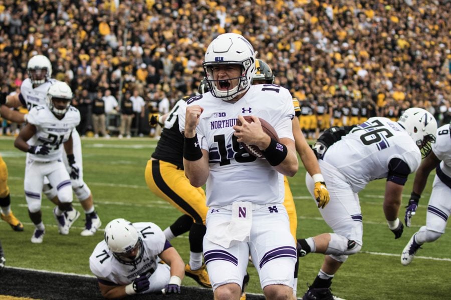
Although admissions applications typically have increased after NU has played in bowl games, applications decreased 5 percent this year despite NU earning a trip to the Alamo Bowl.
Applications increased 22 percent after the 1996 Rose Bowl and 7 percent after the 1997 Citrus Bowl, Bienen said in his State of the University address last week.
“Marketing is probably the big thing,” he said. “After those big Rose Bowl and Citrus Bowl spikes, we’re going down to a more normal place. The only thing you can do is survey those people and look at those students who were admitted to Northwestern but chose not to come.”
The recent branding study surveyed about 2,000 NU students, high school students, counselors and employers nationwide. Among the study’s results, Cubbage said, were that the NU seal did not capture the university’s strengths: its broad range of programs, its proximity to Chicago, the quarter system and graduates’ ability to communicate well.
“We want to refine our communications message to emphasize what is it that makes Northwestern distinctive,” he said.
Integrated Marketing Communications Prof. Frank Mulhern said a university can make itself stand out by replacing its seal with a more unique logo.
“The problem with a seal is that the Latin letters are so common that they provide little meaningful identity,” he said. “When someone sees it, they wouldn’t know what it is. You could take 100 of these seals and put them on a sheet of paper and they would look the same. (A new logo) breaks through the clutter of a very competitive market.”
Lisa Fortini-Campbell, an integrated marketing professor, also said a new logo might help a university hone its image, but that structural changes must also be made to create a significant difference.
“Hopefully, they’ll do a more substantive analysis,” she said. “People say, ‘Oh, we’ll give the whole place a coat of paint and that will fix the problem.’ It’s important not to hope that a superficial brush-up of the logo will take care of this.”
In recent years, several companies have overhauled their logos and tried to update their images with varying degrees of success, she said. Automaker Cadillac, for example, recently revamped its logo to make its brand appear more modern, she said, but the customers and car design did not change much.
“Sometimes a company can spend a lot of money changing the logo when they do relatively little to look at where their image comes from,” she said.
Cubbage said administrators are working with the consulting firm Cagney + McDowell to narrow down their options and hope to unveil the new logo before the end of the school year.
He said he hopes the new logo will make NU more recognizable across the country and emphasize the strengths of NU’s individual schools.
According to the study, people in the Northeast are generally not as familiar with NU, while the university is well-known in the Midwest, Cubbage said. The study also indicated that people generally think the university has strong communications and journalism programs but don’t think as highly of its engineering program.
McCormick senior Joon Yoon said changing the logo will give the university more respect and help it attract higher quality students.
“We’re a pretty nice school, but we don’t get any kind of respect outside of the Midwest,” he said. “(The logo) doesn’t stand out like the ones at other top schools.”
Even so, Weinberg sophomore Richard Miao said, creating a new logo breaks with tradition and won’t change the university’s image.
“I don’t see any reason to change it,” he said. “It makes sense to keep something that’s a tradition. It has been around since the beginning of the university. It’s like changing the flag of the United States.”


